My Favourite Norwich Shirt – 1997-1999 Home
Cameron Huggett explains how a combination of mustard and high fashion led to his favourite ever Norwich City shirt

Before I begin, I must admit that I am not the type of supporter who typically wears a shirt to the match. For better or worse, hotter or colder, I am a scarf man. Whilst I do have a collection of football shirts, public appearances tend to be restricted to the 5-a-side pitch. To me, there is something about a mass-produced piece of nylon with a faceless corporate logo plastered on it that screams ‘game’s gone’, but each to their own.
That being said, there are always exceptions to the rule. For me, the pinnacle of the art form is Norwich’s 1997-99 home kit.
I cannot provide any personal anecdotes about seeing this kit in action, as I was only born a few months before it was first introduced. However, I hope I can explain why I believe it to be one of the finest, and most interesting, shirts to grace the Carrow Road pitch.
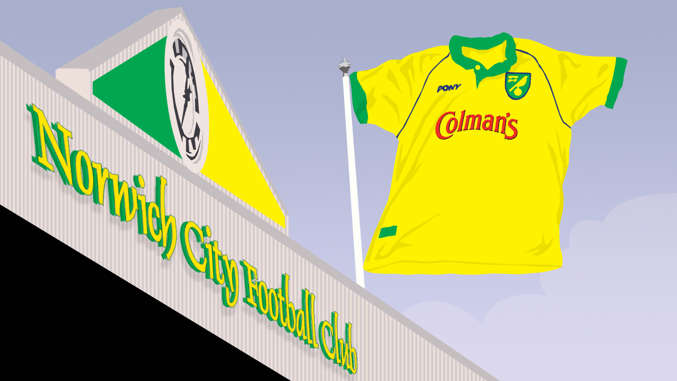
The physical characteristics of the kit alone mark out as a thing of beauty. In contrast to the pallid, sickly yellow of recent seasons, this shirt is of a deep, golden hue, accented with light green collars and cuffs, as well as a bold Prussian blue piping. A refined grandad collar gives this shirt a classic appearance, whilst the baggy fit and longer sleeves accentuate its retro credentials. Then there is the material. No plastic here, just light, soft cotton.
But this shirt is all about the sponsor, resplendent in red felt: Colman’s Mustard. This is everything a sponsor should be, not some dubious betting company or multinational conglomerate using a football club as a billboard to shill something no one wants or needs. Colman’s are as intertwined with the culture of the City of Norwich as The Canaries, and both club and brand have been instrumental in promoting the City to the world. The two had been inseparable long before this collaboration. After all, it was the Colman family who sold the land that would become Carrow Road to the Club when they moved away from The Nest in the 1930s. This is a sponsorship that was meant to be and was sadly short-lived.
Diving deeper into the eccentricities of this shirt, you gain the distinct impression that it could only have been conceived in the Nineties, the decade where Britain convinced itself it was the coolest place on the planet with all the ill-judged confidence of an estate agent downing his sixth pint of Stella before belting out Don’t Look Back in Anger in the middle of a Wetherspoons. It was also a decade where British football underwent something of a transformation. The advent of the Premier League gave the domestic game a greater platform than it had ever enjoyed before, clubs reinvented themselves with new or revamped stadiums, and football kits became fashion statements in their own right (think Arsenal’s bruised Banana away kit, or every keeper shirt). Yet, old sensibilities remained in this shiny new era. All of this is encapsulated within the story of this shirt.
Firstly, it’s made by Pony, one of the de rigueur manufacturers of the era. More importantly, it was designed by Bruce Oldfield, whose couture pieces have been worn by celebrities and royalty alike. Not only does this demonstrate a level of pretentiousness on the part of the Club that I’m sure we can all get behind, it surely beats the ‘Football_Kit_Template_1.0.jpeg’ that so many opt for? Oldfield was approached by newly appointed director Delia Smith in an effort to revitalise City, in what was possibly our biggest plateau since we were first promoted to the top flight in 1972. The shirt was intended to be a fashion statement, pre-empting the current trend for retro-kits-as-streetwear by about two decades, if you ask me. The icing on the cake was Oldfield’s admission that he was worried about his beloved design becoming muddied during play.
To match the ‘high fashion’ design, the launch event was a catwalk show that has aged far worse than you can imagine, with players lining up alongside Norfolk-born model Sarah Thomas, who flew back especially from Australia for the event. Her fee for participating in the kit launch? A season ticket for herself and her dad, of course.
But, the kit was not without controversy. The bold new design featured yellow shorts. This caused quite the stir amongst the Norwich faithful, with a campaign being launched alongside the local press to have the colour changed back to green. Such as the level of ire, the club saw fit to hold a vote before the home match against Bristol City in 1998. Each supporter was given a yellow card and green card. They could then choose which to hold aloft, in order to judge the support for the corresponding pair of shorts. Despite Delia backing Yellow, she was decisively outvoted. If ever there was an episode that sums up the pettiness of football supporters, it surely must be this. Personally, the yellow shorts are not a favourite of mine, but I’m also not planning on wearing the full kit any time soon, so it doesn’t detract too much from shirt for me.
To cap all this off, over twenty years after it debuted, this shirt emerged as a display of solidarity. When it was announced that Colman’s was being moved away from Norwich in 2017, City supporters took to wearing this shirt in protest against the ending of two hundred years of history, and the loss of 350 jobs.
This shirt might not be connected with Norwich’s finest moments, unlike the Poll & Withey or Egg and Cress shirts. Nor is it made by one of the more famous brands. But for me, it is the perfect combination of aesthetics, eccentricities, and identity.
FORZA NODGE BADGE - *SALE PRICE*
ADI-NODGE BADGE - *SALE PRICE*
Inter-nodge-ale Badge - *SALE PRICE*
Comments
There are no comments on this article yet.
Edie Mullen's Ncfc Social Media Watch - March 2022
18/03/22
In the first of a new series, Edie Mullen takes a deep, deep, deep dive into the world of Norwich City related social media content. Hold onto your hats.
The ACN Podcast Episode 94
01/04/22
Jon and Tom are joined by Edie to talk through all the negativity and not really find a way through it. Still, only 9 games to go.....
